Project Brief
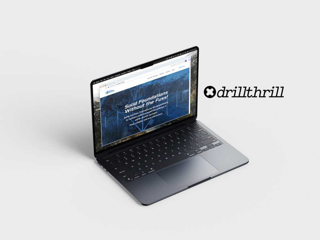
drillthrill were approached to overhaul the brand identity of Earth Anchors Tasmania, as well as design a website to base their marketing strategy around.
A snapshot of the concept progression
Suitable colourways were explored
The chosen logo direction will work in many environments
From many ideas, the logo design converged on being a symbol of an anchor penetrating the ground. The silhouette and colour palette conveys strength and professionalism.

The website design is desktop, tablet and smartphone responsive.
Previous
Next