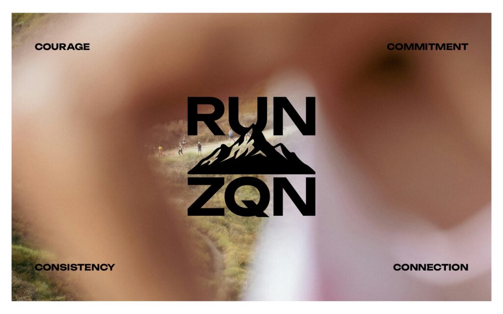
drillthrill explored the intersection of movement, terrain and locale.
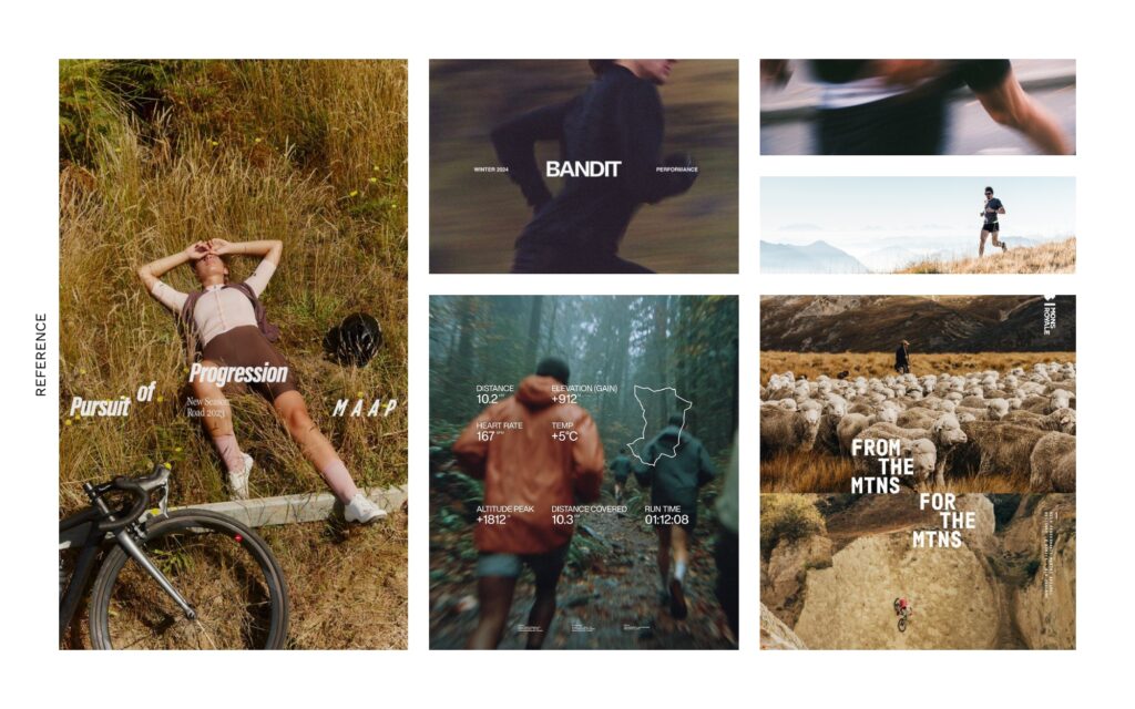
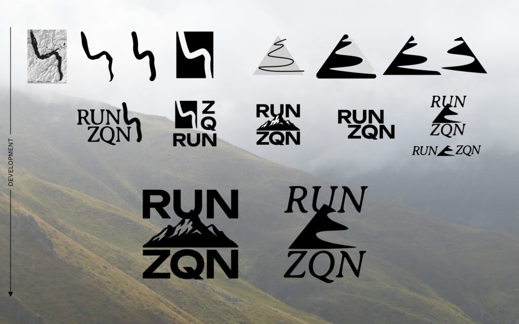
Early exploration focussed on the visual language of the landscape surrounding Queenstown – lake, mountain forms and trail lines – alongside the sharper cues of performance culture.
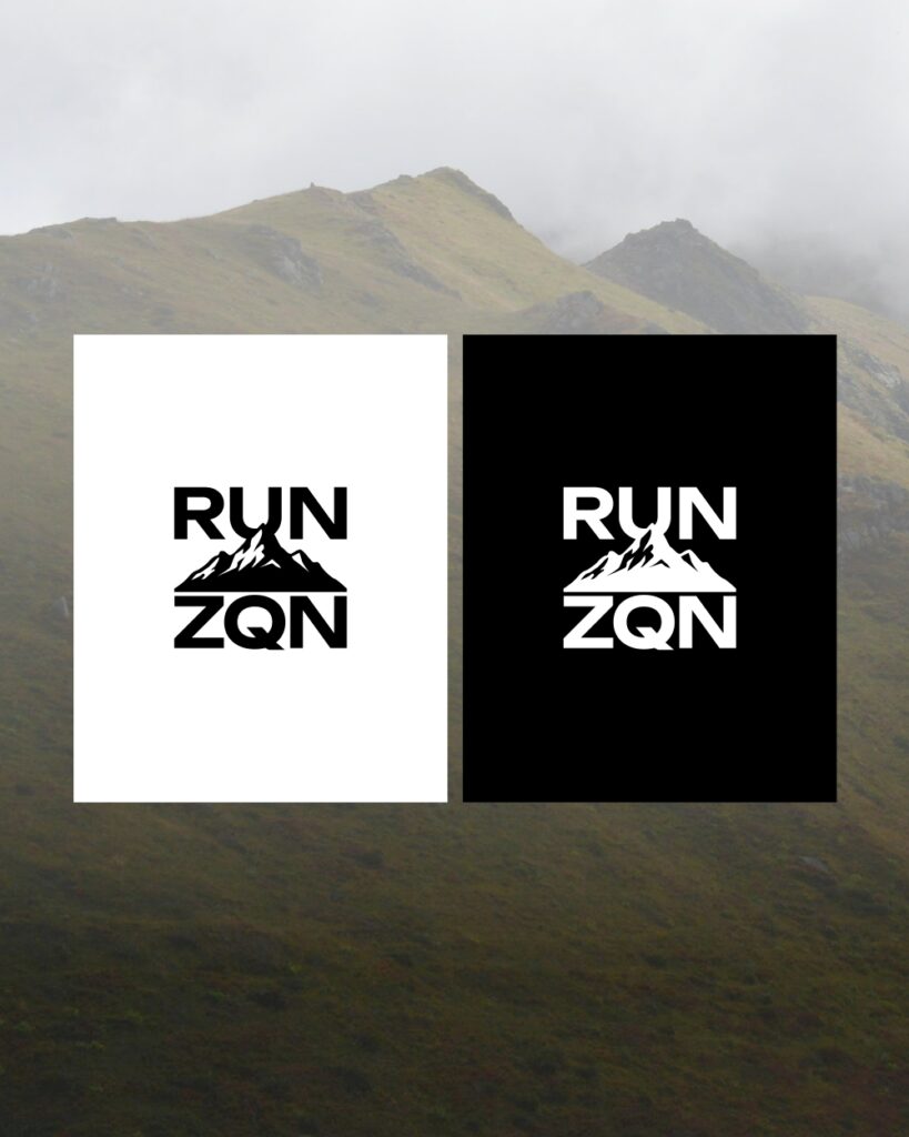
The aim was to distil the outdoors into a mark and system that felt immediate, bold and enduring.
From there, the direction was narrowed towards a cleaner identity that balanced natural symbolism with athletic clarity.